When checking my emails and waiting for my storyboard animatic to upload I came across and article about movie trailers and how they can sometimes be misleading when comparing it to an actual film. Now, although I am not making an full film I have to create the illusion that I have so that the audience knows what is going on and can fill in the blanks and sort of understand what is going on.
http://uk.movies.yahoo.com/blog/article/92187/most-misleading-movie-trailers.html
The article talks about how people complain that all the good stuff is put in the trailer like explosions or seeing someone get shot but none of the boring walking about and talking scenes. But as the article rightly suggests how else would the companies that have created the trailer sell the film to its audience. Noone wants to sit there at the end of a movie trailer and think "What the hell have I just watched?" after seeing a full 2 minutes of a person walking around or just talking to someone. The audience want to be left asking good questions like "What happens!?".
Although you might be thinking "Well that's all that is in her current trailer (Referring to my current rough cut) just some guy walking around looking a bit lost. Where's all the action?". Well fear not because as I have pointed out the current version of the trailer is only a rough cut and nothing is set in stone. I will be making some improvements with the editing and action scene's will be in the trailer.




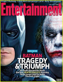 Like the previous magazine the image takes up most of the page and although the images is dark and used the same colours as the elements that make up the rest of the page such as the text. Like the other magazine its uses dark colours like the blacks and reds that make the magazine like the other horror magazine that I analysed.
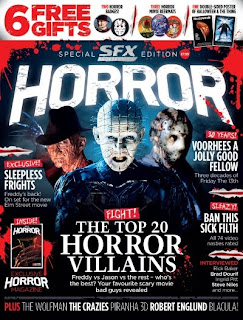 As you can see the main colours used on the page are red and black. These colours are quite representative of the horror genre. Also the majourity of the page is taken up by the main image of the three horror villians with medium close-ups which would be representative of the horror films with them being the main characters. The theme through out the page is kept to the colours of the image which means that aswell as the picture standing out it isnt clashing with the page and t does look like it belongs there.


